Projects / Luminary
Luminary Campus Navigation
Commercial map apps miss what students with mobility needs care about on campus: working elevators, steep slopes, accessible entrances and construction detours.
I designed accessible routing for a campus navigation app and tested it in 50+ student sessions.
- Product
- Luminary iOS app (AppTeamCarolina)
- Organization
- University of North Carolina at Chapel Hill
- Role
- UX Designer
- Timeline
- September 2025 to May 2026
- Team
- Collaborating with iOS developers and product leads
- Scope
- Accessible routing, user research, usability testing, iOS interface design
- Tools
- Figma
Outcome
- 50+Student usability testing sessions
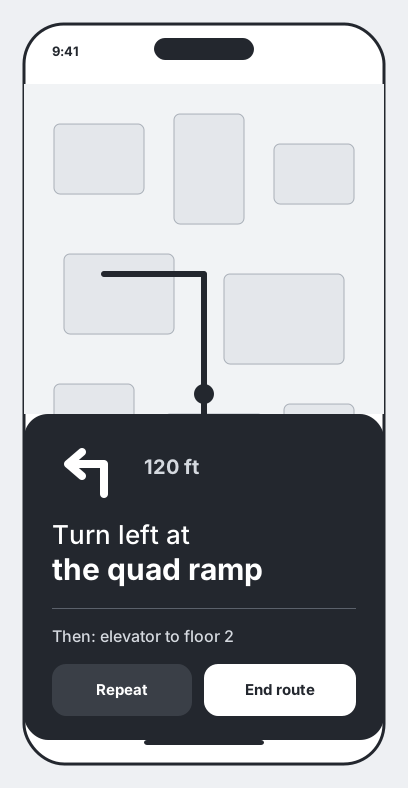
Luminary is still in development, so I can’t show its screens. The wireframes on this page are my own illustrations of the flows, not the shipped design.
Problem
Problem and accessibility scope
Getting around a large campus like UNC Chapel Hill is hard for new students, and harder for students with mobility impairments, temporary injuries or visual disabilities.
Commercial map apps like Google Maps miss campus details that decide whether a route works: working elevators, steep slopes, accessible building entrances and temporary construction detours.
- Problem statement
- How might we give students real-time, accessible campus navigation that accounts for mobility needs, elevator outages and steep slopes?
Research
User research and usability testing
I ran semi-structured interviews and more than 50 student usability testing sessions at locations across campus.
- Unannounced obstacles
- Students using wheelchairs or crutches often ran into stairs nobody warned them about, or building elevators that were out of service.
- Hidden entrances
- First-year students struggled to find accessible building entrances in the short time between classes.
Design
Phased strategy and route architecture
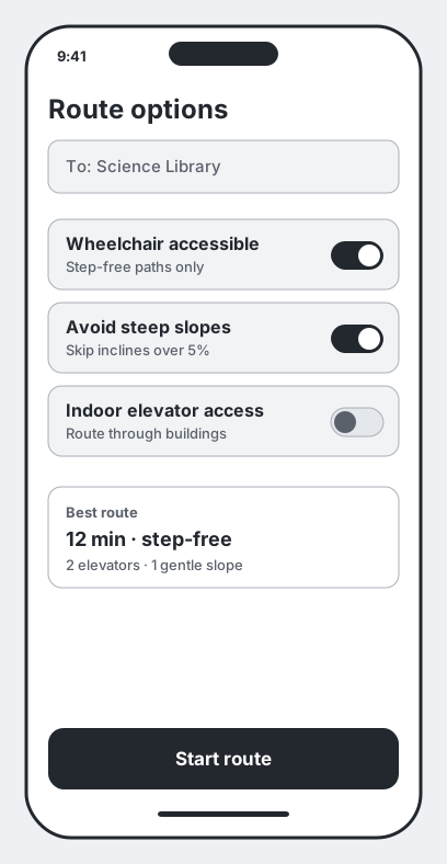
- Phase 1 · Route filtering
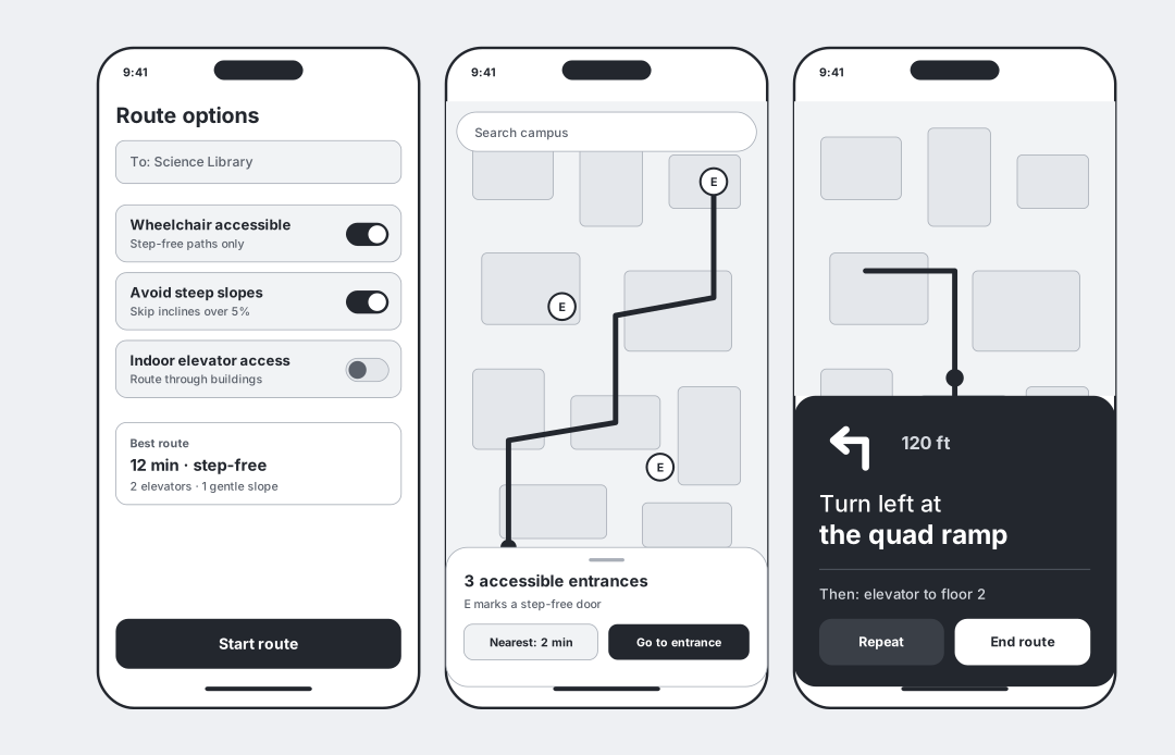
- Accessible route toggles: Wheelchair Accessible, Avoid Steep Slopes and Indoor Elevator Access.
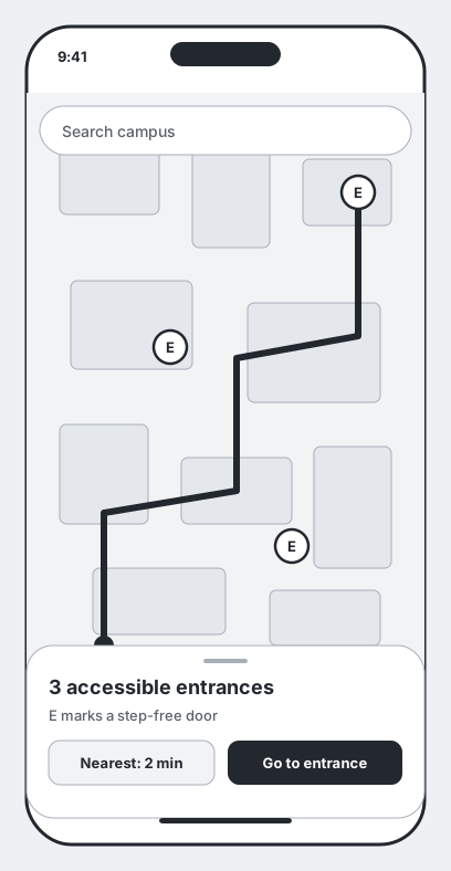
- Phase 2 · Map interface
- Map overlays with elevation markers and pins for accessible entrances.
- Phase 3 · Turn by turn
- Accessible turn-by-turn cards with audio and VoiceOver support.
Key design decisions
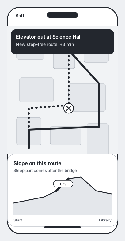
Rerouting around obstacles
When someone reports an elevator outage or a construction barrier, a banner appears and the route recalculates on its own.
Slope before you walk
A route elevation graph flags steep inclines before students set off.
High-contrast direction cards
Large, high-contrast cards that stay readable in bright sunlight and work with one hand.
Illustrative wireframes
Because of the NDA, I drew these low-fidelity wireframes myself to show how the flows work. They are not Luminary’s real screens.
Test
Testing
I measured navigation task completion across 50+ student sessions, looking at how fast students picked a route and whether they avoided detours.
I then refined the user flows and prototypes, and built reusable design-system components and variants that cut interaction steps.
Takeaways
- Accessibility helps everyoneDesigning for mobility needs made navigation clearer for all students, including those carrying heavy equipment or walking in bad weather.
- Real-time accuracy builds trustA navigation app is only as reliable as its live data. Clear warnings for construction barriers built long-term trust.
More projects
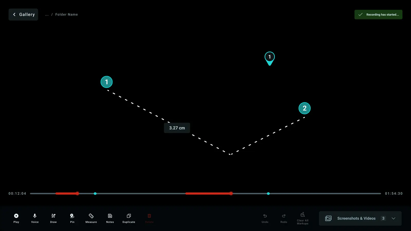 Luna Surgical ConsoleUX design at Karl Storz. Three projects for Luna, a robotic surgery console: arm identity, a gallery with a video editor, and live annotation.
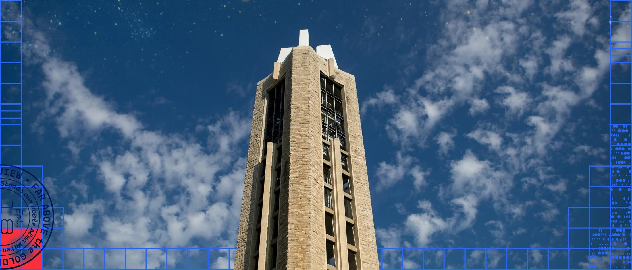 KU BrandResearch, design and frontend for the University of Kansas brand site, part of a campus-wide rebrand across websites serving 50,000+ users. Traffic across ku.edu grew 30% after launch, a team result.
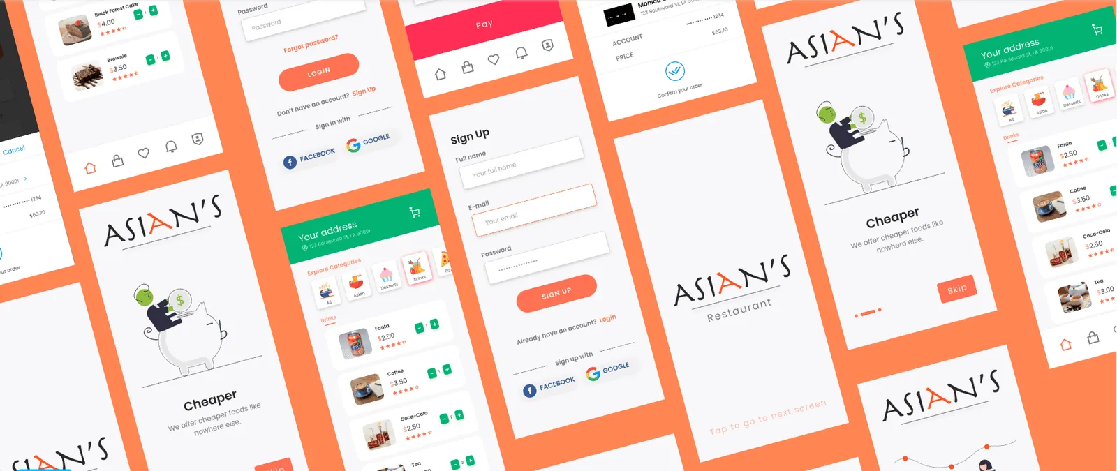 Asian’sVolunteer UX research and design for a Berkeley restaurant: a mobile ordering app guests can use without talking.
 Esri CalciteUI/UX design and front-end internship at Esri: an internal documentation website for the Calcite Design System, for designers and developers.